Customization Guide
Overview
With the Operaio ITSM Portal you have very rich options to customize the look and feel of the portal. From the beginning of the development process, Operaio kept in mind that the portal will be customized by our customers. The options range from very light customization of the colors, logos etc. to very heavy customization of pages, views and the backend API.
Some information about customizations are already documented in the Administration Guide. This document will go through the customizations in more detail and will refer to the Administration Guide for some topics.
Possible ways to customize the portal
There are several areas of customizations available for the ITSM Portal v3. By clicking on a specific topic, you will directly jump to this section:
- Light Customization
- Themes Customization
- Views Customization
- Form Customization
- Icons Customization
- Analyst Navigation Customization
- End User Navigation Customization
- Authorization
- Custom Console Tasks
- Extension Customization
- Client-side development: Custom JavaScript files
Upgrade-in-mid approach
When designing customization options, we always think about how our customer will use them and how the upgrade process of the portal will be. We try to keep the upgrade process as simple as possible even if your instance of the portal is highly customized. If you follow this guide, then all your customizations will be untouched during the upgrade process. Of course, you still need to do some manual steps to add customizations for new features but your existing code and your customizations will be overtaken during the upgrade process.
Requirements
Administration Guide
Some general information about settings, security, etc. are already documented in the Administration Guide. Also, the basics of customizations can be found there. In this guide, we will go discuss the customization in more depth. Before starting with customizations, please go through the Administration Guide of the ITSM Portal.
Rights and Permissions
Your account must be able to access/modify the ITSM Portal file content under C:\inetpub\ITSMPortalV4. To test your customizations your account must also be a member of the corresponding security group in SCSM.
For more information about the rights and security roles in SCSM, please refer to the section Security and Permission in the Administration Guide.
Tools
You need a tool to modify files of the following types
- *.css
- *.cshtml
Operaio recommends using “Notepad++” which can be downloaded from the manufacturer’s website: https://notepad-plus-plus.org/
Skills
Some customizations require knowledge of HTML and JavaScript and a very good understanding of Service Manager. You will need to change or create type projections.
Localization
If you plan to use multiple languages within a form or a view you have the possibility to use a Global Localizer to manage the display names in multiple languages. For this topic, please refer to the Localization chapter in the Administration Guide.
Light Customizations
For very light customizations, like fonts, colors or any other CSS rules, you can use a custom.css. The custom.css will be loaded after all other styles, this means you can use it to override other styles.
Operaio recommends to not use the custom.css to change links to images, font files, etc. Use a custom theme instead.
The custom.css was introduced in version 3.0.0.4 and you can use it for the End User and the Analyst Portal. Those files must be placed in:
- /lib/ui/themes/%THEMENAME%/enduser/custom.css
- /lib/ui/themes/%THEMENAME%/analyst/custom.css
where %THEMENAME% is the name of the folder with our theme, which is “base” by default.
Themes Customization
With a custom theme, you can create your own CSS styles, and change images and icons. A custom theme must be created when you want to change standard CSS styles and\or images.
Compared to the out-of-the-box “base” theme, which will be overwritten with every upgrade of the portal, your custom theme will never be touched by the upgrade process.
The disadvantage of using a custom theme is that you must merge changes from the “base” theme with your custom after every upgrade where new UI features were introduced or the base styles were changed. Not all upgrades will contain CSS changes, so please always refer to the Installation Guide which also discusses the upgrade process.
To create a custom theme, you have to create a new folder under /lib/ui/themes and copy the content of the /lib/ui/themes/base to this newly created folder. Then you can change your current theme in the portal settings. Please refer to the Administration Guide for information about the portal settings.
Some basic information about the themes is also covered in the Themes chapter of the Administration Guide.
Theme structure
For the theme structure, you can refer to the picture below:
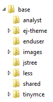
| Folder | Description |
|---|---|
| analyst | CSS styles for the Analyst Portal |
| ej-theme | Base CSS styles and icons for Grids. Some specific grid styles are implemented for each part of the portal in corresponding CSS files. |
| enduser | CSS styles for the EndUser Portal |
| images | All images and icons used in the portal |
| jstree | Base CSS styles and icons for the Tree View component |
| less | LESS files (see next chapter) |
| shared | CSS styles for the entire portal |
| tinymce | CSS styles for the HTML editor used in the Knowledge Base |
The structure of the theme folder will not change but the content of each folder is subject to change in future versions.
LESS file
To simplify theme changes you can use a LESS files. The advantage of using LESS files is that you can just change some variables in LESS (like colors, paths, font, margins etc.) but the main CSS rules will not be touched. You are able to compile new versions of the CSS files after an upgrade by just replacing the variables.
The information below is relevant for version 3.1.0.5 and above.
Operaio ships LESS files with each release. You can find those under *wwwroot\lib\ui\themes\base\less* folder. You can use any LESS compiler. You must compile the CSS files to the same folders where you find the out-of-the-box CSS files.
The upgrade process for themes looks like this:
- Compare your LESS files with the “base” LESS file and add new CSS rules or change existing ones
- Compile your LESS files and put them in the right location
More information can be found in the Administration Guide.
Views Customization
Introduction
You can find some basic information about the views in the Administration Guide under:
In this section we will describe how to customize an existing view, how to create a custom view and how to use a custom landing page.
The ITSM Portal is based on modern Microsoft technologies: .Net Framework 4.6.1, ASP.NET Core and MVC. As part of MVC we are using Razor markup to create a rich HTML UI. Razor markup is a mix of HTML and C# code, and located in .cshtml files. Such files are named “Views”.
There are three types of views used in the ITSM Portal:
- Layout view: This is the main view with all headers, scripts and the main page layout.
- Child view: Views that are loaded from the application as content views. They are always rendered inside of the layout view.
- Partial view: Is part of the Razor markup and can be used in any layout or child view.
Customize existing views
You can customize any existing view by creating a copy of the view and changing the name of the file to %ViewName%custom.cshtml or %ViewName%%ThemeName%.cshtml. The order in which the portal tries to find views is:
- %ViewName%_custom
- %ViewName%_%ThemeName%.
- %ViewName%
This means: The _custom view file will always “win”. This allows you to quickly change something in the view without impacting the out of box file or your theme file.
Never change out-of-the-box files. They are overwritten by the upgrade process. You must create a custom view in order to keep your customization untouched during an upgrade.
We suggest using the following practice to create custom views:
- Copy the view that needs to be changed to %ViewName%_custom.cshtml
- Perform the required changes and test them.
- Rename the custom view file to %ViewName%_%ThemeName%.cshtml
- When you will need to do additional changes in this view, just copy your current %ViewName%_%ThemeName%.cshtml to %ViewName%_custom.cshtml an repeat steps 2 and 3.
Restart website
Please note that you have to restart the website in IIS for view changes to take effect.
Create a custom view
To create a new custom view, for instance to show some very custom UI or to provide some custom dialogs, you can a create a .cshtml file in the Views\CustomViews\ folder. Then you can reference to those views by URL /CustomViews/%ViewName%.
Use a custom landing page
Since version 3.0.0.4, the ITSM Portal allows you to use custom landing pages for both, Analyst and End User Portal. You can enable or disable the landing page for each part in the Portal Settings (please refer to the Administration Guide for more information about Portal Settings).
The landing pages can be found here:
- Areas\EndUser\Views\Items\LandingPage.cshtml
- Areas\Analyst\Views\Analyst\LandingPage.cshtml
Please use custom views to avoid replacing those files during an upgrade.
Form Customization
Introduction
Operaio ITSM Portal allows you to customize the forms of various configuration items and work items. In the following we describe how to create and configure custom forms for specific classes. The approach is different between the Analyst and the End User Portal.
A basic overview over form customization can be found in the Administration Guide. In the following part, we will take a more detailed look on this topic.
Analyst Portal
You can modify an existing or create a new form file. To create a custom form for the Analyst Portal, basically two steps are required:
- Create Custom Form File
Create your custom form in a CSHTML file. - Link Custom Form
Link your custom form to a Service Manager Class and specify the Type Projection.
Page Structure
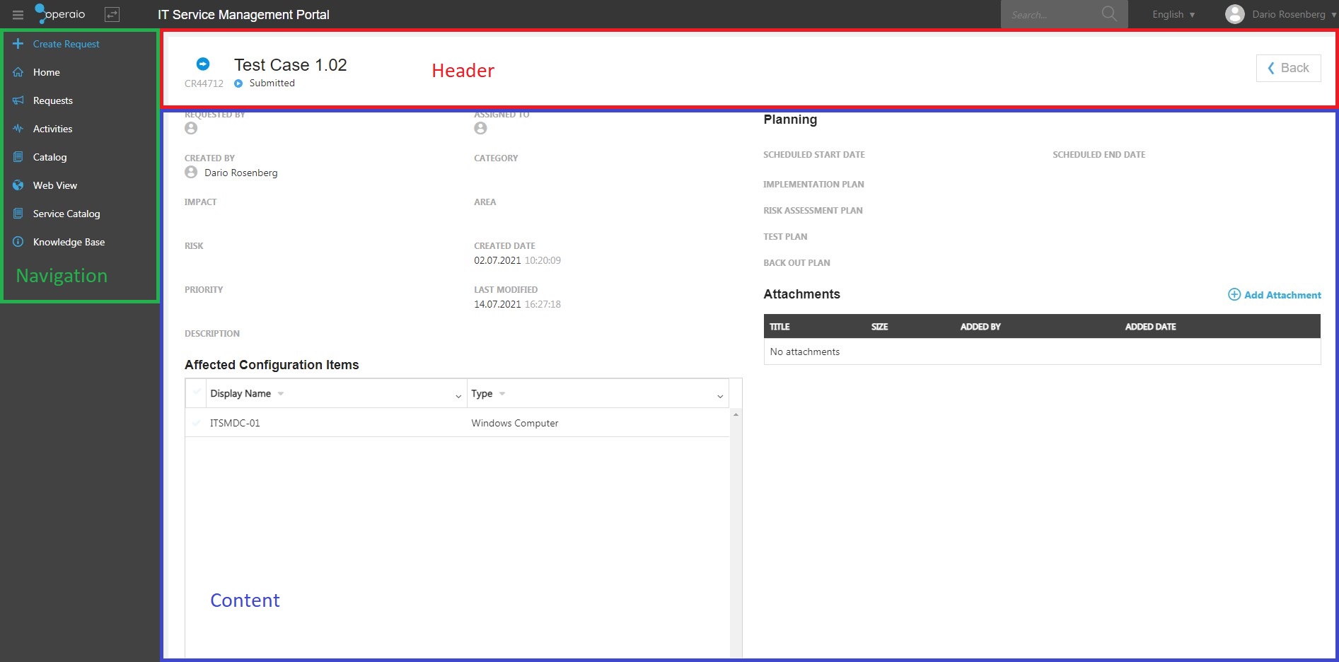
An Analyst from contains several sections you can modify the following section in your custom form:
- Title
- Header
- Tabs
- Content
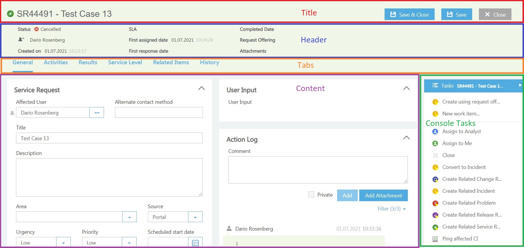
The Console Tasks are covered in a separate section!
Changing existing form file
To modify an existing form please refer to the section Changing existing forms in the Administration Guide.
Create custom form file
You can create your custom form using CSHTML.
The form files must be placed in the installation path of your ITSM Portal Server: %\Areas\Analyst\Views\Forms
To create a new custom form, you can copy an existing form folder and rename it. Make sure that you also rename the form files.
An Analyst Portal form is divided in multiple files.
- SampleClass_DefaultForm.cshtml
The DefaultForm structure of the page. It specifies the header, the tabs and the file for each tab is linked. - SampleClass_GeneralTab.cshtml
Defines the properties and the structure of your General form tab. - SampleClass_SampleTab.cshtml
Defines the properties and the structure of an additional form tab.
Default Form
Within the Default Form the Header and the Tabs, with the related files, are defined.
Header
The header is defined in the in the header section:
@section emo_header{
}
In the header section, you can define the properties which should be displayed. Each property can be defined with the following:
<div class="col-sm-3">
    <ul class="list-unstyled">
        <li><b></b><span ng-bind="formContext.$Class$.DisplayName"></span></li>
    </ul>
</div>
As Header Title, you can specify a string or use a “GlobalLocalizer”. You can access your properties using the formContext. Generic properties like “DisplayName” and “TimeAdded” must be placed into $$. Please refer to Service Manager SDK for a full list of generic properties.
Together with generic properties you can use our custom properties:
- $Class$: The class definition for the object. Available for any object in the system.
- $TypeProjection$: The type projection (or “combination class”) definition. Available only for projection objects (form object always is projection object)
For example:
- formContext.Status.DisplayName
- formContext.$Class$.DisplayName
- formContext.$TimeAdded$.Value
Link Tabs
To define the tabs use the tab section in the DefaultForm:
@section emo_tabs{
}
Define the Header Title as string or GlobalLocalizer and define the id of each tab. Make sure the id matches the id in the previously created tab file (<div class="tab-pane active" id="general">).
@section emo_tabs{
    <itx-formtabs>
        <itx-tab header="@GlobalLocalizer["GeneralTab"]" id="general" />
        <itx-tab header="@GlobalLocalizer["SampleTab"]" id="sample" />
        <itx-tab header="@GlobalLocalizer["RelatedItemsTab"]" id="relateditems" />
        <itx-tab header="@GlobalLocalizer["HistoryTab"]" id="history" />
    </itx-formtabs>
}
In the end of the DefaultForm the required form files of each tab must be specified:
@await Html.PartialAsync("[Folder]/[FileName]")
@await Html.PartialAsync("SamlpeCIClass/SampleCIClass_GeneralTab")
Tabs
For each tab you can create an own .cshtml file within your previously created folder. It is also supported to create all tabs in one file. In the tab file you specify the properties and the structure of your custom tab.
Use the following as template for your custom tab file (please don’t forget to change the id of the tab element):
<div class="tab-pane active" id="general">
    <div class="itx-mod-col-slg">

    </div>
</div>
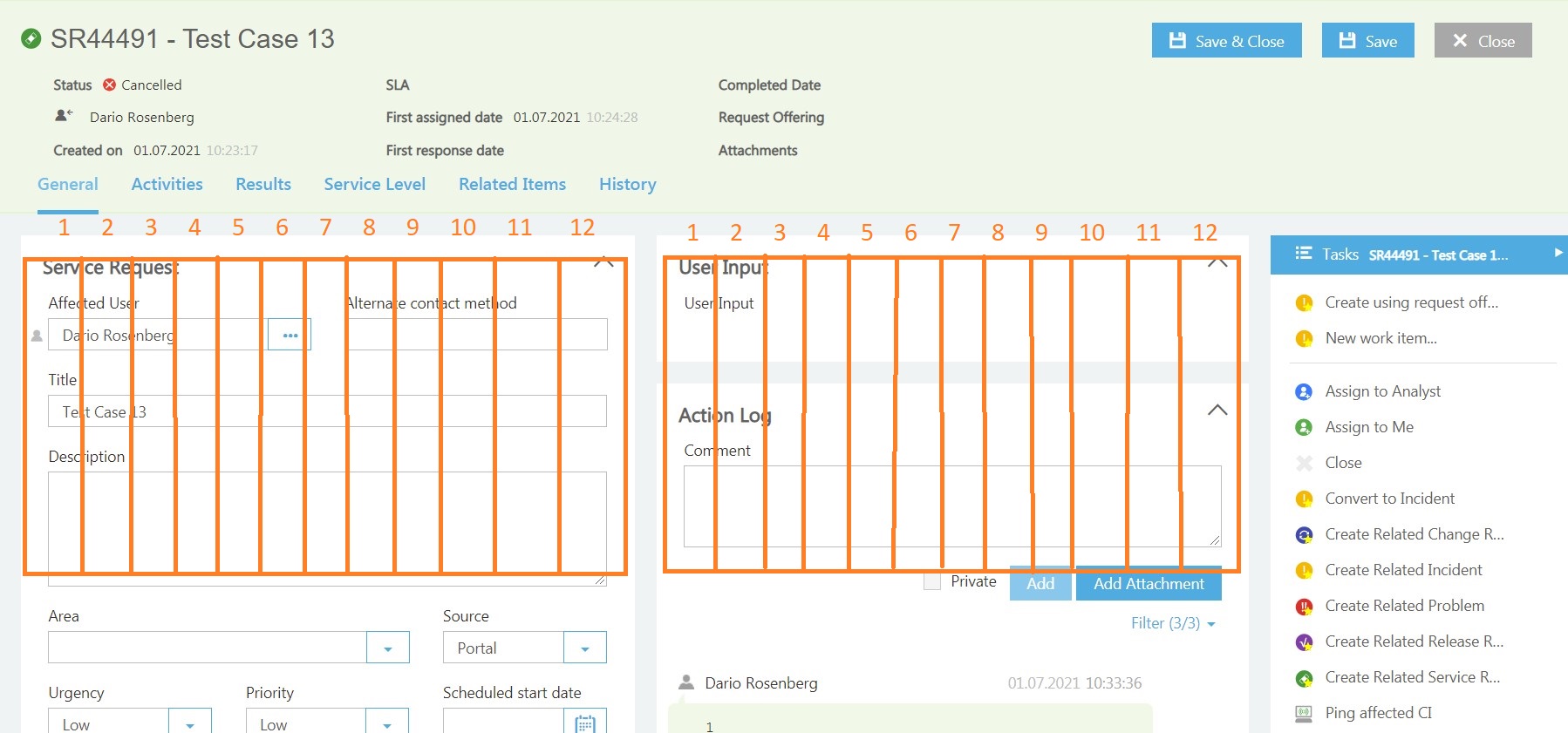
Structure
Within the tab you can use two structures:
- One Column Mode

To define a one column tab use the following template:
<div class="card-block collapse-card">
    <div class="header">
        <a href="#" class="heading pull-left"><span>Section Header</span></a>
        <a href="#" class="arrow-collapse-btn pull-right"><i class="icon-dropdown_up"></i></a>
    </div>
    <div class="collapse-content">

    </div>
</div>
- Many Columns Mode
To define a many column tab, use the following template:
<div class="tab-pane active itx-row" id="general">
    <div class="itx-mod-col-slg">
        <div class="card-block collapse-card">
            <div class="header">
                <a href="#" class="heading pull-left"><span>First section of Column 1</span></a>
                <a href="#" class="arrow-collapse-btn pull-right"><i class="icon-dropdown_up"></i></a>
            </div>
            <div class="collapse-content">

            </div>
        </div>
    </div>
    <div class="itx-mod-col-slg">
        <div class="card-block collapse-card">
            <div class="header">
                <a href="#" class="heading pull-left"><span>First section of Column 2</span></a>
                <a href="#" class="arrow-collapse-btn pull-right"><i class="icon-dropdown_up"></i></a>
            </div>
            <div class="collapse-content">

            </div>
        </div>
    </div>
</div>
If you have multiple custom tabs, make sure only one tab has set the active class:
<div class="tab-pane active" id="general">
Columns-Span Attribute
The portal is built on a Bootstrap framework and we’re using “bootstraps grids” to define the sections in the form.
For more information about Bootstrap please refer to the official guide on the Bootstrap site.
The columns-span attribute can be defined as columns-span="”. You can have maximum 12 columns, so values can be, for instance, 12, 6, 4, etc.
Properties
To access and display the properties of your SCSM classes Operaio provides some type specific controls which can be used in the cshtml. A list of all available controls and attributes for the Analyst Portal can be found in the appendix.
The properties are defined within in the form section:
<div class="collapse-content">
    <form role="form">
        <div class="form-group">
            <div class="row">
                <itx-stringcontrol property="ID" columns-span="6" readonly="true" required="true" />
                <itx-enumcontrol property="Status" columns-span="6" required="false" />
            </div>
        </div>
        <div class="form-group">
        </div>
    </form>
</div>
To access properties from other classes than the target class, you can use the following sample:
<itx-stringcontrol property="DisplayName" classortypeprojectionid='new Guid("5a3c98a2-1d5d-fcb2-9a20-574b0dc089c6")' alias="WorkInstruction_Has_Offering" header="Offering" columns-span="12" read-only="true" />
Dynamic Tabs
It is possible to load tabs dynamically by specific criteria. This allows you to load different tabs for objects of the same class. Therefore, you can define multiple tabs in one file using the ng-if option to show only the required one:
<div class="tab-pane active" id="referenceditems" ng-if="formContext.GssType.EnumName == 'EnunMaehere'"> ...</div>
<div class="tab-pane active" id="referenceditems" ng-if="formContext.GssType.EnumName != 'EnunMaehere'"> ... </div>
Default Tabs
The following tabs are covered for all forms and don’t need to be recreated. The form files can be found in the root directory \Forms:
Configuration Items
- Related Items
- History
Work Items
- Activities
- Service Level
- Related Items
- History
These tabs are also linked in the DefaultForm in the following sections
@section emo_tabs{
<itx-formtabs>
    <itx-tab header="@GlobalLocalizer["GeneralTab"]" id="general" />
    <itx-tab header="@GlobalLocalizer["SampleTab"]" id="sample" />
    <itx-tab header="@GlobalLocalizer["RelatedItemsTab"]" id="relateditems" />
    <itx-tab header="@GlobalLocalizer["HistoryTab"]" id="history" />
</itx-formtabs>
}
In the end of the file the tab files are loaded:
@await Html.PartialAsync("[Folder]/SampleCIClass_GeneralTab")
@await Html.PartialAsync("[Folder]/SampleCIClass_SampleTab")
@await Html.PartialAsync("CI_RelatedItemsTab", new RelatedItemsSettings() { WIsAffectedAlias =  "RelatedWorkItem", WIsAlias = "ImpactedWorkItem", CIsAlias = "RelatedConfigItem", KBsAlias = "RelatedKnowledgeArticles", AttachmentsAlias = "FileAttachment" })
@await Html.PartialAsync("HistoryTab")
Link custom form
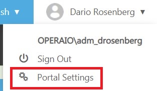
After creating a new custom form in the file content, it needs to be linked to a class and a Type Projection. Here for please navigate to the Administration section of the ITSM Portal v3:
- Login as an Administrator Role to the Portal
- Navigate to the Portal Settings
- In the Analyst Form Settings fill out the following information:
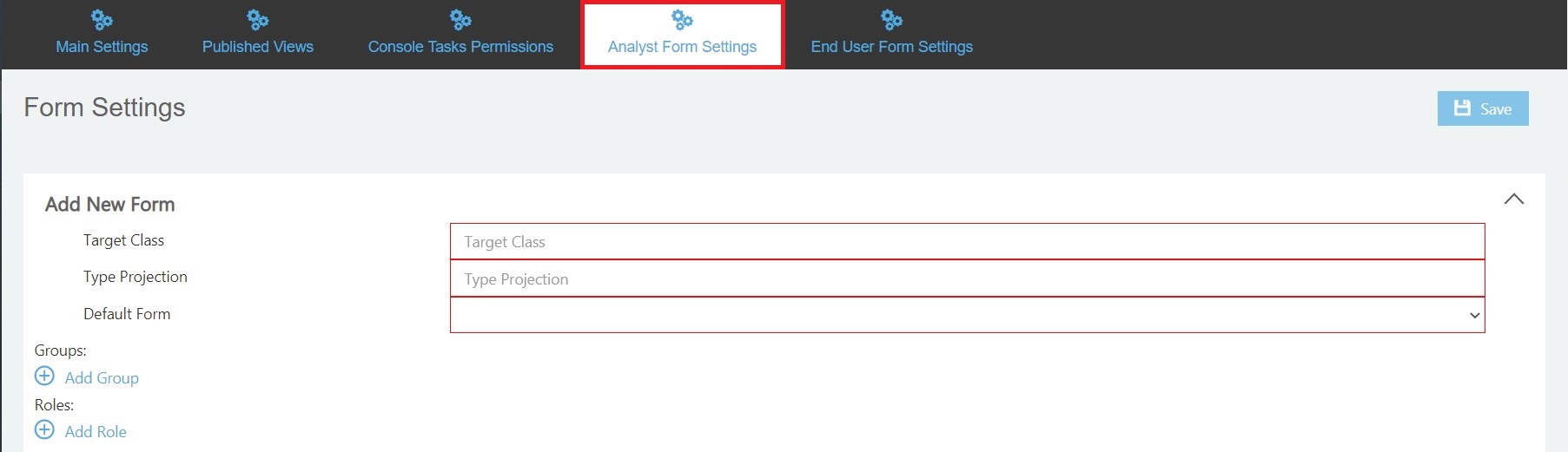
Target Class (Required)
Specify the SCSM class for which you previously created the form.
For example: Microsoft.AD.User
Type Projection (Required)
Specify the SCSM Type Projection you want to use for this form.
Default Form (Required)
Specify the path to your previously created Default Form file.
Groups (Optional) / Roles (Optional)
For more detailed information about Groups and Roles and how to use them, please refer to the Administration Guide chapter Constraining forms by AD groups or SCSM user roles.
You can define a custom form for any class in the deriving chain. For instance, you can have a form for the System.User Class, then you can have a form for System.Domain.User and additional form for Microsoft.AD.User. The form of the most derived class’s will win. This is helpful if you have your own derived classes from the base Work Items class (custom derived Incident class, etc).Then you can create forms for those classes with custom fields.
- As last step save the settings by using the Save button
Please note:
The configuration done over the wizard will be saved in a JSON file located under:
C:\inetpub\ITSMPortalV4\wwwroot\Settings\AnalystForms.jsonYou no need to create forms targeted to class extensions. All class extensions are added to the base class automatically. For instance, if you have an extension class for System.WorkItem.Incident and you want to create a form for this class, you can use the same type projection as for the out-of-box form and just add the required fields to your custom form.
KB HTML Editor configuration
The information in this section relevant for Portal version 3.1.0.5 or above
We are using TinyMCE as HTML editor for the Knowledge Base. You can use custom plugins and\or change configuration of the editor.
To add your custom plugin file please add it to \wwwroot\lib\external\tinymce\plugins\.
To change configuration (including enabling your custom themes):
- Create a new JS file in \wwwroot\lib\custom (you may need to create this folder). Name of the file can be any.
- Put following content to the file and replace the section “Put your config here”:
(function () {
    var itsmPortalAnalystApp = angular.moduleSafe('itsmPortal.analyst');
    if (!itsmPortalAnalystApp) { return; }

    itsmPortalAnalystApp.config(['tinyMCEProvider', function (tinyMCEProvider) {
        tinyMCEProvider.options = {
            // put your config here
        }
        tinyMCEProvider.$get = function getter() { return { options: tinyMCEProvider.options }};
    }]);
})();
This will overwrite the existing settings for TinyMCE, so please keep them all. The default settings you can find in \wwwroot\lib\itsmportal\shared\ang.itsmportal.controls.js around line 2284 (defaultOptions variable inside the tinyMCEProvider function). Please do not change this file directly and always use your custom file.
Delayed tab configuration
The information in this section is relevant for ITSM Portal version 3.4.0.4 or above
By default, the data on all tabs are loaded when the form is opened. This can cause a big performance penalty for grid pickers with large amount of data inside. To avoid this, we introduced the concept of “Delayed Tab”. Delayed tabs are not loaded until user clicks it for the first time.
To create new delayed tab, you must:
- Add a new tab reference to your form
- Create a new tab file in the Forms folder or any sub-folder. This file must have a special attribute (see sample below)
- Create a js file in \wwwwroot\lib\custom with the required logic.
- Create a new tab content file in the Forms folder. You can’t place this file to subfolders. The content of the tab must contain full markup of the grid picker. You can’t use itx-gridpickercontrol helper element.
Delayed tab reference on your form
To add new delayed tab you must define new itx-tab helper element in emo_tabs section, set id attribute to unique id of the tab, add delayed attribute and set it to true.
Then you must add link to delayed tab file (see section below)
Example based on default Incident form:
@section emo_tabs{
<itx-formtabs>
    <itx-tab header="@GlobalLocalizer["GeneralTab"]" id="general" />
    <itx-tab header="@GlobalLocalizer["ActivitiesTab"]" id="activities" />
    <itx-tab header="@GlobalLocalizer["ResolutionTab"]" id="resolution" />
    <itx-tab header="Delayed Tab" id="delayedtab" delayed="true" />
    <itx-tab header="@GlobalLocalizer["SLATab"]" id="slainfo" />
    <itx-tab header="@GlobalLocalizer["RelatedItemsTab"]" id="relateditems" />
    <itx-tab header="@GlobalLocalizer["HistoryTab"]" id="history" />
</itx-formtabs>
}
...
@await Html.PartialAsync("WI_Incident/WI_Incident_GeneralTab")
@await Html.PartialAsync("WI_Incident/WI_TroubleTicket_ActivitiesTab")
@await Html.PartialAsync("WI_RelatedItemsTab", new RelatedItemsSettings() { AttachmentsAlias = "FileAttachments" })
@await Html.PartialAsync("WI_Incident/WI_Incident_ResolutionTab")
@await Html.PartialAsync("WI_Incident/DelayedTab")
@await Html.PartialAsync("WI_SLATab")
@await Html.PartialAsync("HistoryTab")
The itx-tab with delayed set to true will add two new variables to the current JavaScript scope: load%ID% and loading%ID%, where %ID% is the ID of the tab. Those variables are set to true when tab is opened for the first time.
Delayed tab file
Here is sample code for the delayed tab.
<div class="tab-pane" id="delayedtab">
    <div ng-if="loadingdelayedtab" style="position:relative" class='e-waitpopup-pane e-widget'>
        <div class='e-image'></div>
    </div>
    <div ng-if="!isNew && loaddelayedtab" class="card-block" itx-delayedtab>
    </div>
</div>
The usage of the variables loadingdelayedtab and loaddelayedtab. We use loadingdelayedtab to show the “loading” UI and loaddelayedtab to render the content of the tab when it is really needed.
The itx-delayedtab is used to render the content of the tab, as described in the next section.
Create JS file to load tab content
Here is a sample JS file to load the required file content:
(function () {
    'use strict';
    var app;
    try { app = angular.module('itsmPortal.analyst'); }
    catch (e) {
        // module not found, exit
        return;
    }

    app.directive('itxDelayedtab', itxDelayedtab);
    itxDelayedtab.$inject = ['$stateParams', '$rootScope', '$timeout'];
    function itxDelayedtab($stateParams, $rootScope, $timeout) {
        return {
            restrict: 'A',
            transclude: true,
            templateUrl: function () {
                return "/Analyst/Forms/SubView/TabRelatedWIs?" + itsmportal.ui.getVersionParam()
            },
            link: function (scope, element, attrs, ctrl, transclude) {
                var previousContent = null;
                scope.$parent["formContext"].MyRelatedWorkItems = null;
                var triggerRelink = function () {
                    if (previousContent) {
                        scope.$parent.loadingdelayedtab = true;
                        previousContent.remove();
                        previousContent = null;
                    }

                    transclude(scope.$parent, function (clone, scope) {

                        element.parent().append(clone);
                        previousContent = clone;
                    });
                    $timeout(function () { scope.$parent.loadingdelayedtab = false; });
                };

                triggerRelink();
                $rootScope.$on("itxObjectSelected", triggerRelink);

            }
        };
    };
})();
The two most important things in this code are the path to the tab content file (TabRelatedWIs in /Analyst/Forms/SubView/TabRelatedWIs) and the alias name for related items (MyRelatedWorkItems). The path to the content tab must match the name of tab content file (see next section). Alias you can choose any, but it must be the same in the content tab and must not duplicate already existing aliases in your type projection.
In our case, file name must be TabRelatedWIs.cshtml. Sample content of the file (code that needs to be changed in custom form is highlighted with %% code %%):
<div ng-if="!$parent. %% loadingdelayedtab %% " class="card-block collapse-card" ng-controller="gridPickerController" ng-init="init(true, '@itnetX.ITSMPortal.Shared.Helpers.Constants.TP_itnetX_ITSMPortal_Analyst_WIRelatedItems_Projection', 'RelatedWorkItems', 'formContext. %% MyRelatedWorkItems %% ', true)">
    <div class="header">
        <a href="#" class="heading pull-left"><span> %% My related WorkItems %% </span></a>

        <div class="control-panel pull-right">
            <form>
                <input type="file" class="hidden" />
                <button class="btn btn-link add" type="button" itx-pickerbutton="formContext.MyRelatedWorkItems" itx-classorprojectionid="@itnetX.ITSMPortal.Shared.Helpers.Constants.Class_System_WorkItem" itx-columns="girdColumns" itx-ismultiselection="true" itx-isprojection="false"><i class="icon-add44"></i></button>
                <button class="btn btn-link delete" type="button" ng-click="removeSelected($event, formContext. %% MyRelatedWorkItems %% )"><i class="icon-paper-bucket"></i></button>
                <a href="#" class="arrow-collapse-btn pull-right"><i class="icon-dropdown_up"></i></a>
            </form>
        </div>

    </div>
    <div class="collapse-content" itx-waitingpopup="loading">
        <div class="no-board" ej-grid e-deepwatch="true" e-datasource="formContext. %% MyRelatedWorkItems %% " e-allowScrolling="true" e-scrollSettings="scrollSettings" e-load="gridLoad" e-allowSelection="true" e-selectionType="multiple" e-allowSorting="true" e-recordDoubleClick="recordDoubleClick" e-actionComplete="gridActionComplete" e-rowSelected="rowSelected">
            <div e-columns>
                <div e-column e-field="DisplayName.Value" e-headertext="@GlobalLocalizer["DisplayName"]"></div>
                <div e-column e-field="Status.Value" e-headertext="@GlobalLocalizer["Status"]" e-type="guid">
                    <i itx-statusicon="data.Status"></i><span ng-bind="data.Status.Value"></span>
                </div>
                <div e-column e-field="CreatedDate.Value" e-headertext="@GlobalLocalizer["CreatedOnHeader"]">
                    <span itx-datetime="data.CreatedDate.Value"></span>
                </div>
                <div e-column e-field="$LastModified$.Value" e-headertext="@GlobalLocalizer["LastModifiedHeader"]">
                    <span itx-datetime="data.$LastModified$.Value"></span>
                </div>
            </div>
        </div>
    </div>
</div>
This is a standard grid picker control (\Analyst\Views\Controls\gridpickerControl.cshtml) but adopted to use with a delayed tab. The key difference is the ng-if="!$parent.loadingdelayedtab" attribute. It prevents loading of data before this grid is displayed. Also, you must define an alias in formContext.MyRelatedWorkItems same as in your JS file.
End User Portal
You can modify an existing or create a new form file. To create a custom form for the End User Portal, basically two steps are required:
- Create Custom Form File
Create your custom form in a CSHTML file. - Link Custom Form
Link your custom form to a Service Manager Class and specify the Type Projection.
Structure
A End User from contains several sections you can modify the following sections in your custom form:
To modify the Navigation, please refer to the Navigation section in this document.
Changing existing form file
To modify an existing form please refer to the section Changing existing forms in the Administration Guide.
Create custom form file
You can create your custom form using CSHTML.
The form files must be placed in the following path on your ITSM Portal Server: inetpub\ITSMPortalV4\Areas\EndUser\Views\Forms
To create a new custom form, you can copy an existing form folder and rename it. Make sure that you also rename the file inside the folder. After that you can modify the properties and the layout in the cshtml file. We recommend to use the sample template for the End User form as base. It can be found in the appendix.
Title / Header
To modify the title/header, use the following section:
<div class="row title-cont-bl mod-req-p">
    <div class="col-lg-12">
        <div class="alert-bl pull-left"><i itx-objecticon="formContext"></i><span>{{formContext.Id.Value}}</span></div>
        <div class="h-status_rate-wrap pull-left">
            <h1>{{formContext.Title.Value}}</h1>
            <div class="status-rate-wrap">
                <div class="status pull-left"><i itx-statusicon="formContext.Status"></i><span>{{formContext.Status.Value}}</span></div>
            </div>
        </div><a class="cancel" href="" ng-click="closeForm()"><i class="icon-close"></i></a>
    </div>
</div>
Content
To add your custom properties and content, you can use the section below:
<div class="row">
    <div class="col-lg-6">
        <div class="row">
            <div class="col-xs-12">
                <itx-stringcontrol property="Description" multiline="true" />
            </div>
        </div>
    </div>
    <div class="col-lg-6">
        <div class="row">

        </div>
    </div>
</div>
To access and display the properties of your SCSM classes itnetX provides some type specific controls which can be used in the cshtml. A list of all available controls and attributes for the End User Portal can be found in the appendix.
Link custom form
- Login as an Administrator Role to the Portal
- Navigate to the Portal Settings
- In the End User Form Settings fill out the following information:
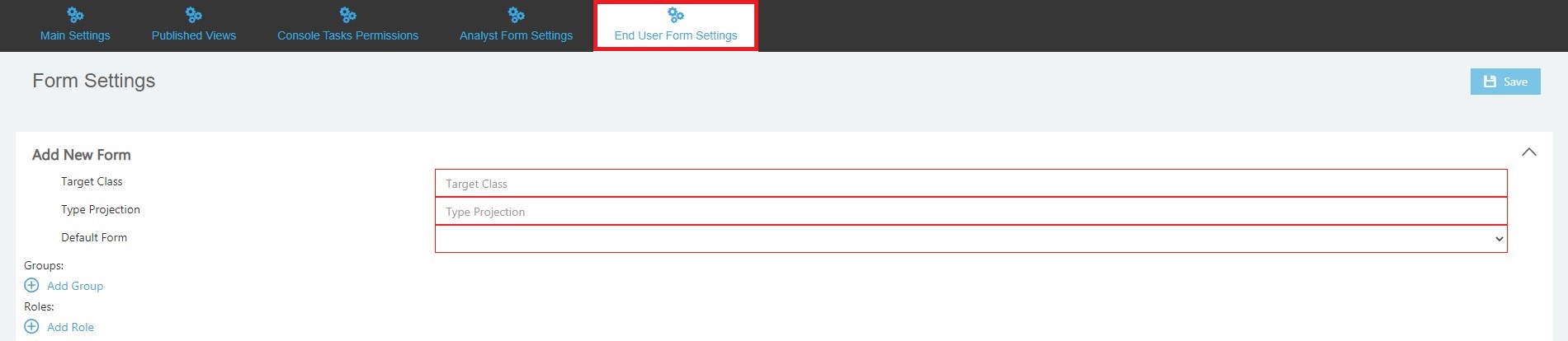
Target Class (Required)
Specify the SCSM class for which you previously created the form.
For example: Microsoft.AD.User
Type Projection (Required)
Specify the SCSM Type Projection you want to use for this form.
Default Form (Required)
Specify the path to your previously created Default Form file.
Groups (Optional) / Roles (Optional)
For more detailed information about Groups and Roles and how to use them, please refer to the Administration Guide chapter Constraining forms by AD groups or SCSM user roles. - As last step save the settings by using the Save button
The configuration done over the wizard will be saved in a JSON file located under:
C:\inetpub\ITSMPortalV4\wwwroot\Settings\AnalystForms.json
Icons Customization
Classes
The icon’s CSS class is calculated based on the SDK class name. The class name must be translated to lowercase and the . (dot) needs to be replaced with _ (underscore). Like the following example:
System.WorkItem.Incident system_workitem_incident
The base CSS class for a class icon is object-icon-small and the base sprite is images/sprite-16x16.svg
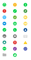
Status
The Status icons are implemented in the header of a form and in a grid list, if the column’s field name is equals “Status”. Status icons are calculated based on an Enumeration name. The enumeration name must be translated to lowercase and only the part after last dot (.) is need. Like the following example:
IncidentStatusEnum.Active ** active**
The base CSS class for a status icon is icons-status and the base sprite is images/status_sprite.svg
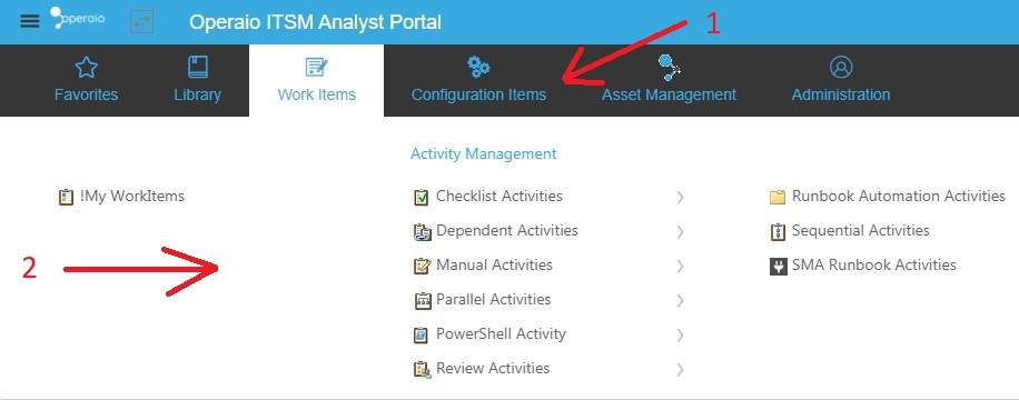
Analyst Portal Navigation Customization
Analyst Portal loads all published folders from the SCSM. Please refer to Administration Guide for instruction how to publish\unpublish views and show this process works in general. This section covers some styles customization only.
Analyst Navigation contains from two parts: root navigation links (1) (same as wonderbars in SCSM) and carousel navigation menu with horizontal scroll (2):
Carousel navigation menu
Since entire navigation calculated dynamically, many UI styles are not possible to change just with CSS, so this guide covers some of such customization. The following things can’t be customized in carousel menu using CSS:
- Rows count
- Columns count
- Count of columns to scroll per one scroll
Those parameters possible to change in the file \Areas\Analyst\Views\Shared\_AnalystNavigation.cshtml using ng-init attribute of the nav element:
<nav id="main-nav" ng-controller="navigationController" ng-init="init(10)">
The first parameter is row count, default value is 6 This value can’t be less than 4. You will get an error if you will try to set it less than 4 and default value will be used.
Second parameter is optional and can be used to set columns count (variable “slidesToSlow”) and count of columns to scroll (variable “slidesToScroll”) using JSON notation:
{slidesToShow: 3, slidesToScroll: 3}
Aside with fixed number of columns you can use responsive numbers, when count of columns depends on width of the browser window:
ng-init="init(10, {slidesToShow: 3, slidesToScroll: 3, responsive: [{breakpoint: 1366, settings: { slidesToShow: 2,slidesToScroll: 2 }}]})"
The “breakpoint” is the min width when parameters from “settings” variable start working. You can have more than one such object, because responsive is an array.
You can use object with any settings of Ken Wheeler’s Slick plugin for JQuery (https://github.com/kenwheeler/slick) as second parameter.
We using version 1.6.0, so please check if parameter supported by this version. Default configuration:
{
    infinite: false,
    speed: 300,
    prevArrow: '<button type="button" data-role="none" class="slick-prev" aria-label="Previous" tabindex="0" role="button"></button>',
    nextArrow: '<button type="button" data-role="none" class="slick-next" aria-label="Next" tabindex="0" role="button"></button>',
    slidesToShow: 6,
    slidesToScroll: 6,
    responsive: [
        {
            breakpoint: 1366,
            settings: {
                slidesToShow: 4,
                slidesToScroll: 4
            }
        }
    ]
}
End User Navigation Customization
In the following we’re going to describe how to customize the navigation section
This customization is only supported for the End User Portal.
The navigation for the End User Portal is defined under:
\Areas\EndUser\Views\Shared\_EndUserNavigation.cshtml. and the file has the following structure:
Out of the box the navigation is split in two different sections: Views from Service Manager itself (automatic views) and static views (like Service Catalog and KB).
Static Navigation
The static navigation is defined in Areas\EndUser\Views\Shared\_EndUserNavigation.cshtml as static <li> element. The following shows a sample:
<li ui-sref-active="active">
   <div class="link-row">
       <i class="icon-information51"></i><a ui-sref="knowledge-base">@GlobalLocalizer["EndUserMainMenuKB"]</a>
    </div>
</li>
These attributes need to be changed, where the first is the icon and the second is the angular state:
i class="icon-information51"
ui-sref="knowledge-base"
You can also define Create New * links:
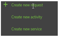
To define such links please create a
<!-- Sample menu for direct items. See #323 --> section in the .cshtml. You can use any type of links. To create a link to a specific Request Offering you can use the following snippet:
<li>
    <a ui-sref="request-form({roId: '00ff16f7-919b-94a0-4938-1972f0c47b11', serviceId: 'd478e445-df58-dcd4-77d1-b2a4e43a24cb'})">Create new service</a>
</li>
Where roid is the internal ID of the Request Offering and serviceId is the internal ID of the Service Offering. You can get both id’s, roId and serviced, from the URL:
http://localhost:14108/EndUser/ServiceCatalog/CreateRequest/00ff16f7-919b-94a0-4938-1972f0c47b11?serviceId=d478e445-df58-dcd4-77d1-b2a4e43a24cb
Dynamic Navigation
The dynamic navigation is used to load folders and views directly from Service Manager. For more details about this topic, please refer to the Administration Guide - Custom views.
The only setting that not comes from Service Manager is the navigation icon. To define a navigation icon, you have to create a custom CSS class. The name for this class needs to be calculated by the rule: icon-@folder.Name.Replace(".", "").
For example: If the folder name is itnetX.ITSMPortalSupporting.EndUser.Activities.Folder then the class name will be icon-itnetXITSMPortalSupportingEndUserActivitiesFolder.
To define an icon, you can use the following snippet:
.icon-itnetXITSMPortalSupportingEndUserActivitiesFolder:before {
  content: "\e91f" !important;
}
The content is an Unicode symbol which can be found under wwwroot\lib\ui\fonts\itnetx-iconfont\itnetx-iconfont.*. You can use codes from 900 to 957 (HEX). To get a full list of icons you can navigate to /Admin/Helpers/IconsSample
Also you can use any regular static images.
Change loading from automatic to manual
To remove the automatic loading of a view, you need to remove the foreach operator at line 20 in the _EndUserNavigation.cshtml and add all the links manually:
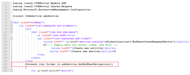
To add an item for the Home view please use the following snippet:
<li ui-sref-active="active">
   <div class="link-row"><i class="icon-itnetXITSMPortalSupportingEndUserHomeFolder"></i><a
   ui-sref="home">Home</a></div>
</li>
To add additional views you need to know the ID. You can find the ID in the URL when you open the view:
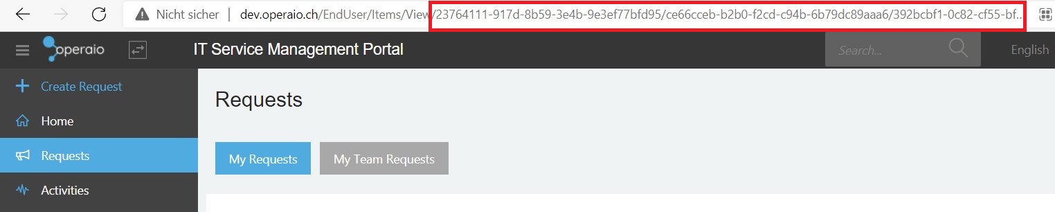
Then you can use the ID for the item, like the following:
<li ui-sref-active="active">
    <div class="link-row">
        <i class="icon-itnetXITSMPortalSupportingEndUserRequestsFolder"></i>
        <a ui-sref="folder({folderId:'23764111-917d-8b59-3e4b-9e3ef77bfd95'})">Requests</a>
    </div>
</li>
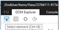
To find out the right icon class you can use the Select Element tool of the development tool integrated in your browser (F12):
The following shows a list of common icons:
| Icon | Class |
|---|---|
| Home | icon-itnetXITSMPortalSupportingEndUserHomeFolder |
| Requests | icon-itnetXITSMPortalSupportingEndUserRequestsFolder |
| Activities | icon-itnetXITSMPortalSupportingEndUserActivitiesFolder |
A problem when disabling the automatic loading is the localization. If you don’t need to translate views to different languages then you must use hardcoded strings in the file as shown in the Request sample above.
If you need to translate the views in different languages you need to add the new strings to the resx file. Please refer to the Administration Guide - Localization for more information.
This is applicable only if you want to show views in manual way. For automatic views localization from Service Manager are used.
In the end, a sample could look like the following. In this case the order is Home, Requests, Service Catalog, Activities and KB:
<ul class="list-unstyled nav-sidebar">
        <li>
            <div class="link-row sub-menu">
                <i class="icon-add1"></i>
                <ul class="list-unstyled sub-links">
                    <li><a href="" ui-sref="service-catalog">@GlobalLocalizer["EndUserCreateRequestButton"]</a></li>
                    @*<!-- Sample menu for direct items. See #323 -->
                         <li><a href="">Create new activity</a></li>
                        <li><a href="">Create new service</a></li>*@
                </ul>
            </div>
        </li>
        <li ui-sref-active="active">
            <div class="link-row"><i class="icon-itnetXITSMPortalSupportingEndUserHomeFolder"></i><a ui-sref="home">Home</a></div>
        </li>
        <li ui-sref-active="active">
            <div class="link-row"><i class="icon-itnetXITSMPortalSupportingEndUserRequestsFolder"></i><a ui-sref="folder({folderId: '23764111-917d-8b59-3e4b-9e3ef77bfd95'})">Requests</a></div>
        </li>
        <li ui-sref-active="active">
            @if (sdkService.PortalSettings.EndUserPortalSettings.ServiceCatalogMode == itnetX.ITSMPortal.Areas.EndUser.Models.ServiceCatalogModeEnum.Browser && sdkService.PortalSettings.EndUserPortalSettings.ServiceCataloDefaultSOId != Guid.Empty)
            {
                <div class="link-row"><i class="icon-text150"></i><a ui-sref="service-catalog-list({soId: '@sdkService.PortalSettings.EndUserPortalSettings.ServiceCataloDefaultSOId'})">@GlobalLocalizer["EndUserMainMenuServiceCatalog"]</a></div>
            }
            else
            {
                <div class="link-row"><i class="icon-text150"></i><a ui-sref="service-catalog">@GlobalLocalizer["EndUserMainMenuServiceCatalog"]</a></div>
            }
        </li>
        <li ui-sref-active="active">
            <div class="link-row"><i class="icon-itnetXITSMPortalSupportingEndUserActivitiesFolder"></i><a ui-sref="folder({folderId: '02736d52-9b2a-cf42-d9cb-8130db28ac0e'})">Activities</a></div>
        </li>
        <li ui-sref-active="active">
            <div class="link-row"><i class="icon-information51"></i><a ui-sref="knowledge-base">@GlobalLocalizer["EndUserMainMenuKB"]</a></div>
        </li>
    </ul>
Authorization
Security Helper
With the ITSM Portal v3 you can check user roles against the following:
Check AD Group Membership
To check the AD Group membership of an user you can user the following ASPN.NET Core IsInRole method:
@if (User.IsInRole(@"SCSMSOL\SCSMAdmins"))
{
    <somehtml> </somehtml>
}
Check User Role Profile Membership
You can use the following PowerShell Snippet to get a list of available User Roles:
Import-Module SMLets
$mg = New-SCSMSession -PassThru
$mg.Security.GetProfiles() | select DisplayName, Id
To check the User Role Profile membership you have to use the SDK service provider. This provider needs to be added to each view definition, as it is not available as default. Add the following line on top of the view definition (*.cshtml):
@inject itnetX.ITSMPortal.Models.SDK.ISdkService sdkService
After that you will able to use provide to check Profile User Role Membership:
@if (sdkService.IsUserInProfile(itnetX.ITSMPortal.Models.SDK.UserRoleProfileEnum.Administrator))
{
    <somehtml></somehtml>
}
Please Note
The check against the User Role should have no performance impact because all the available User Roles for the User are cached in the session. This means also if you change an User Role you have to wait until the section expires (default idle time is 10 minutes) or you reset the session.
Custom Console Tasks
Console Tasks are available for forms and views. The assignment of a task is based on the object class.
Tasks are full based on Angular JS (Angular 1) framework, so this section assumes that you have basic knowledge of Angular 1.
Create Task File Templates
To create a new task, you must create a new .js file or for out of the box tasks you can use the wwwroot/lib/itsmportal/ang.itsmportal.consoleTasksDefinition.js file.
For a new empty file, you can use the following snippet:
(function () {
    'use strict';

    var app;
    try { app = angular.module('itsmPortal.analyst'); }
    catch (e) {
        // module not found, exit
        return;
    }

    app.run(['consoleTasks', '$templateCache', 'globalizeWrapper', '$rootScope', '$http',
          function (consoleTasks, $templateCache, globalizeWrapper, $rootScope, $http) {

              // PUT YOUR TASKS HERE
          }]
      );
})();
The creation of the main task, which needs to be added in the // PUT YOUR TASK HERE section, is described below.
Create Main Task
To create a new task, you need to define a new console task object and then register the task for a specific class. To create the console task object you have to prepare the function for the task execution and for the task checking. A simple template for a task could look like the following:
var refreshFormTask = consoleTasks.createConsoleTask(
    "TASKIDNOSPACESPLEASE",
    "Task Display Name", // will be displayed on the page
    "cssclass",
    // execute task
    function (selectedObjects, scope) {
        var self = this;
        // TASK LOGIC HERE
    },
    //check criteria
    function (objects, scope) {
        // CHECK SOMEHTING HERE
            return true;
        }
    );

// register task
consoleTasks.registerConsoleTask("System.Entity", refreshFormTask);
If you will use your task only for one class then you can skip the variable and define the class inside the registerConsoleTask function:
consoleTasks.registerConsoleTask("System.Entity",
consoleTasks.createConsoleTask(
    "TASKIDNOSPACESPLEASE",
    "Task Display Name", // will be displayed on the page
    "cssclass",
    // execute task
    function (selectedObjects, scope) {
            var self = this;
            // TASK LOGIC HERE
        },
        //check criteria
        function (objects, scope) {
            // CHECK SOMEHTING HERE
            return true;
        }
    ));
Add the main task into the previously created template.
You can find more Console Task samples in the appendix
Variables
The following list shows available variables for task execution and checking functions:
| Variable | Description | |
|---|---|---|
| selectedObjects | - | Array of selected objects, full model |
| scope | scope.isForm Return true if scope is a form. scope.update(values) Update objects with selected values. This method will not commit changes back to SCSM |
Current page scope. The properties of the scope depend on where you run this task: in a view or in a form. |
Extension Customization
Sometimes you will need to change the XML data of the request offering extension object (this object stores extended configuration, such as multimapping, prompt layout, etc.) manually. To do this, you have to export the XML data file, add your changes and import it again.
- Export XML Data
To export the XML data you can use the following snippet. The following section needs to be changed:$roDisplayName([xml]$ext.MultiMappings).Save("D:\!Tmp\$extId.xml")
Import-Module SMLets

# Change this section
$roDisplayName = "Showcase: multimapping"

$clExt = Get-SCSMClass -Name itnetX.Extensions.ITSMPortalCMDB$
$clRO = Get-SCSMClass -Name System.RequestOffering$

$ro =  Get-SCSMObject -Class $clRO -Filter "DisplayName = '$roDisplayName'"
if(!$ro){
    throw "Request offering '$roDisplayName' not found"
    return
}

$extId = "ITSMPortal_" + $ro.Path

$ext = Get-SCSMObject -Class $clExt -Filter "Name = '$extId'"
if(!$ext){
    throw "Extension for request offering '$roDisplayName' not found (Name: '$extId')"
    return
}
# Change this section
([xml]$ext.MultiMappings).Save("D:\!Tmp\$extId.xml")
- Modify XML Data
Do your required changes to the XML. - Import XML Data
Now you can import the changed XML data back into Service Manager. Therefore, you can use the following snippet. Same as above you have to change these two properties:$roDisplayName([xml]$ext.MultiMappings).Save("D:\!Tmp\$extId.xml")
Import-Module SMLets

# !!!! CHANGE THIS !!!
$roDisplayName = "Showcase: multimapping"

$clExt = Get-SCSMClass -Name itnetX.Extensions.ITSMPortalCMDB$
$clRO = Get-SCSMClass -Name System.RequestOffering$

$ro =  Get-SCSMObject -Class $clRO -Filter "DisplayName = '$roDisplayName'"
if(!$ro){
    throw "Request offering '$roDisplayName' not found"
    return
}

$extId = "ITSMPortal_" + $ro.Path

$ext = Get-SCSMObject -Class $clExt -Filter "Name = '$extId'"
if(!$ext){
    throw "Extension for request offering '$roDisplayName' not found (Name: '$extId')"
    return
}

$multimappingXml = [xml](Get-Content "D:\!Tmp\$extId.xml")
$ext.Item($null, "MultiMappings").Value = $multimappingXml.OuterXml
$ext.Commit()
Client-side development: Custom JavaScript files
You can place any JavaScript files in the wwwroot\lib\custom\ (this folder doesn’t exist by default) and all *.js files will be loaded by both portals: Analyst and End User.
We suggest to use Angular Modules for client-side development purposes.
JS files from custom folder will be used for both, Analyst and EndUser parts, so please check if specific module is available, for instance:
var app;
try { app = angular.module('itsmPortal.analyst'); }
catch (e) {
    // module not found, exit
    return;
}
Since version 3.1.0.4 you can use helper to do that:
var itsmPortalAnalystApp = angular.moduleSafe('itsmPortal.analyst');
if (!itsmPortalAnalystApp) { return; }
External Validation
You can use external validation for any prompt types in Request Offerings. Please refer to the Administration Guide for more information how to use and configure External Validation.
External Validation allows you to achieve complex validation of data input by your users, such as check if a user name already exists, check if the requested space is available on the network share, etc. You can implement any scenario for External Validation, but keep the performance in mind: your script should not run longer than a few seconds, better less, because the webpage will be blocked while the validation runs.
External Validation is based on PowerShell. All scripts are stored inside the SCSM CMDB as instances of the class itnetX Validation Script. You can create new scripts from the request offering configuration dialog, or using the Add task on the Validation Scripts view in the SCSM Console .
How it works
When external validation is enabled on a user prompt, the validation script will be executed when the value of the given prompt is changed.
Moment of execution
When you use external validation with a user prompt of type string, then the validation and writes to the data model will happen after the string text box loses focus (aka on-blur), for instance when the cursor leaves the textbox. If external validation is not enabled, then data is written to the model on change of the text box (each key press).
The API will gather all data from the current request offering and send it to the server. The server will find the script in the CDMB and execute it against the retrieved data.
The PowerShell script must return $true or $false as the last object in the execution context. For example, these snippets are correct:
# Script 1
$formData
return $true
# End of Script 1

# Script 2
$true
# End of Script 2

# Script 3
return $formData["f_c658a8820750ee5596517c12a68b44e9"] -eq "test"
# End of Script 3
The Following snippet is not correct (because the last returned object is not $true or $false):
# Script 1
$formData["f_c658a8820750ee5596517c12a68b44e9"] -eq "test"
$value
# End of Script 1
Dynamic validation message
Since version 3.7.13 you may return a string instead of
$false
Returning a string will be interpreted as$false(invalid). Furthermore, the returned string will overwrite the specified validation message.
Validation Scripts variables
You can use the following pre-defined variables in your script:
| Variable name | Description |
|---|---|
| $value | Current value of the prompt. - DateTime: ISO format - MPList: guid of selected enumeration - Query Result: JSON-like serialized object (Data Format, see below) |
| $questionId | Internal id (guid) of the current question |
| $formData | $formData (JSON-like object). Contains all answers for all questions and some additional information (Data Format, see below) |
| $mg | Instance of the current EnterpriseManagement-Group. All calls to the SDK will be performed under the application pool account. |
| $question | Current question instance. Contains all information about the question configuration, including question type |
| $questions | List of all questions |
| $uploadPath | Full path to upload folder |
$value
The current data of the user prompt the validation occurs for. Contains processed arrays. All other values are always strings (see Data Format section below).
$formData
The $formData variable contains the pure data model. You can get the current data for any question. To do that you have to use the indexer operator ([]) and provide the indexer name for prefix “f_” and question ID in 32-digit format (00000000000000000000000000000000, “N” format for .NET ToString() method), for instance:
$formData["f_c658a8820750ee5596517c12a68b44e9"]
If you only know the ordinal of the question you can use the question id and retrieve the data from the $questions variable like this:
$Q3 = $questions | ? {$_.Ordinal -eq 3}
write-host $Q3
If the data is an array (this is the case for attachments and repeating tables), then the indexer name will have a “[]” postfix, because the data model is sent to the server as application/x-www-form-urlencoded.
Keep in mind: instead of $formData, the $value variable always contains processed data, so if data is an array then $value will contain the actual array, but $formData will contain a comma-separated string
$question and $questions
The $question and $questions variable contain information about the current or all questions. Each question supports following properties:
| Name | Type |
|---|---|
| AddressableOutputs | Dictionary[string,string] |
| ConditionDependedQuestion | guid |
| ConditionIsUseForPage | bool |
| ConditionMode | ConditionModeEnum |
| ConditionOperator | DependOperators |
| ConditionQueryResultColumn | string |
| ConditionValue | System.Object |
| Configuration | System.Object |
| ControlType | string |
| ControlTypeEnum | ROControlType |
| DefaultValue | System.Object |
| DependentFromOther | bool |
| DependentOn | Dictionary[int,string] |
| ExternalValidationMessage | string |
| ExternalValidationScriptId | System.Nullable[guid] |
| Id | guid |
| IsInsideRepeatingTable | bool |
| IsPageAutoForward | bool |
| IsPageBreak | bool |
| IsRepeatingTable | bool |
| Optional | bool |
| Ordinal | int |
| PageNmbr | int |
| PageTitle | string |
| ParetROId | guid |
| Prompt | string |
| ReadOnly | bool |
| RepeatingTableFirstQuestion | int |
| RepeatingTableId | int |
| RepeatingTableIdString | string |
| RepeatingTableLastQuestion | int |
| RepeatingTableMaxAppearance | int |
| RepeatingTableMinAppearance | int |
| RepeatingTableShowInSummary | bool |
| RepeatingTableTitle | string |
| Targets | List[System.Collections |
Data Format
Depending on the prompt type, $value and $formData can contain different values:
| Prompt Type | Description | Sample |
|---|---|---|
| String | Value as is | "Test string" |
| Integer | Serialized value | "1" |
| Decimal | Serialized value | "1.2" |
| Date | Serialized value in ISO format | "2017-08-15T21:00:00.000Z" |
| Simple list | Value as is | "Value 1" |
| True\False | "True" or "False" (serialized C# Value) | "True" |
| MP Enumeration List | ID (Guid) of selected enumeration | b69a3387-5ffd-e6f8-f343-ac8da2343687 |
| Query Result | Serialized JSON object (see sample below) | |
| File Attachment | Array of file names (see sample and notes below) |
Query Result data format
As mentioned in the table above, $value (and $formData) contain a serialized JSON object. This object always contains one property “answers”. This property can be null or represent one or more selected objects. Also, this object contains information about the repeating table (RTRow), question id and question ordinal. Sample object:
{
  "answers": [
    {
      "$Id$": "2a0489b4-5091-876b-9d6c-c4fbff0a6b65",
      "DisplayName": "Anton Gritsenko",
      "Domain": "SCSMSOL",
      "UserName": "gritsenko.eng"
    }
  ],
  "RTRow": 0,
  "questionId": "ca40619a7bde4a2995117296e7316931",
  "questionOrdinal": "7"
}
Each object in the “Answers” array contains at least two properties: $Id$ (internal ID of the object in CMDB) and DisplayName. All other properties depend on the Display Columns configuration of the Query Result
File Attachment data format
Files are uploaded to the server before data is written to the main data model, so when your validation script starts, the file will already be uploaded to server. The main data model will contain two properties for each entry: file name and file id.
As mentioned in the $formData section, the $value and the $formData variables contain different values: $value contains an array of file names, but $formData contains a comma-separated string, and the indexer name will have a “[]” postfix:
f_c658a8820750ee5596517c12a68b44e9[]: file1, file2, file3
Also, $formData contains a comma-separated string with file ids (guids). The indexer name has the prefix “fileids_” (instead of just “f_” in the main model) and the same “[]” postfix, for instance:
fileids_f_63e5403aac74499f823939f7585b531e[]: 85bf7c84-0c5b-417b-9dbc-883350f78a78,ab4aa1f0-8242-439a-a186-9eaae4d948c4
You can read the file content from the $uploadPath folder. File name inside this folder will match the file id (we are not using the real file name, to avoid collision).
Debugging validation scripts
Any data written to the standard output (out-default) will be displayed as a message box in the portal, so you can use the Write-Host or Out-Default cmdlets to show data from your script:
if($value)
{
  write-host $value
  write-host $value.GetType().FullName
}
$question | Get-Member | out-default
return $true
Output:
You cannot change the type of the message box. It will always be displayed as an information, regardless of the validation result.
Tips & Tricks
- Enable the Summery Page of a Request Offering to be able to use External Validation for the whole Request Offering before the user can submit. External Validation
- Performance: try to avoid using more than 2 validation scripts on the same page. Validation always occurs on the first page load if values are not null (default values), so having many validations may slow down the user experience.
- Debugging: you can emulate the $mg variable using SMLets (New-SCSMSession or Get-SCSMSession -PassThru)
- Debugging: You can save all variables to XML on the server side and then play around locally
External Data
External Data is designed to provide a quick way to show data results from external sources, such as SQL, CSV files, and PowerShell scripts in Query Result.
Query Result gets data using OData 4 query regardless of whether it is a regular query result or an external data query.
The configuration of External Data is covered in External Validarion.
External Data PowerShell Script variables
The PowerShell script is the most powerful and flexible way to get data from an external source. To get data from an external source you can use the following variables.
For an explanation of variables which are also used for External Validation scripts, please see Validation Scripts variables
| Variable name | Description |
|---|---|
| $queryParams | OData query parameters. Used to get filter and order of the query. See full description below. |
| $formData | $form data (JSON-like object). Contains all answers for all questions and some additional information (Data Format, see below) |
| $filterValue | Helper variable, contains filter value extracted from OData query parameters. This variable will contain exact text that user enter in filter box of the Query Result |
| $mg | Instance of the current EnterpriseManagement-Group. All calls to the SDK will be performed under the application pool account. |
| $question | Current question instance. Contains all information about the question configuration, including question type. See description here |
| $questions | List of all questions. See description here |
| $uploadPath | Full path to upload folder |
| $sdkService | For internal use, not designed to use directly |
| $dependedData | For internal use, not designed to use directly |
$queryParams
Query Result supports following OData parameters: $filter,$orderby, $top, $skip, $select, $expand, $count, $format, $skiptoken, $deltatoken, $inlinecount, but only $filter and $orderby is used in case of Query Result.
The $filter contains full filter query in OData format, and is not empty only if user use the filter box in Query Result. Sample $filter value:
(substringof('test',tolower(Name))) or (substringof('test', tolower(ServicesDependedOn)))
Where Name and ServicesDependedOn are columns name and ‘test’ is value from filter box of Query Result.
We provide more simple way to access filter by $filterValue. You no need to use $filter parameter until you will query data using custom script out of portal UI. In this case you fill free to use any supported parameters of OData.
The $orderBy parameter contains list of columns separated by coma (,) with possible “desc” at the end to describe descendent order. Sample values:
"UserName"
"UserName desc"
$formData
The $formData variable contains the pure data model. You can get the current data for any question. To do that you have to use the indexer operator ([]) and provide the indexer name for prefix “f_” and question ID in 32-digit format (00000000000000000000000000000000, “N” format for .NET ToString() method), for instance:
$formData["f_c658a8820750ee5596517c12a68b44e9"]
If you only know the ordinal of the question you can use the question id and retrieve the data from the $questions variable like this:
$Q3 = $questions | ? {$_.Ordinal -eq 3}
write-host $Q3
If the data is an array (this is the case for attachments and repeating tables), then the indexer name will have a “[]” postfix, because the data model is sent to the server as application/x-www-form-urlencoded.
Keep in mind: instead of $formData, the $value variable always contains processed data, so if data is an array then $value will contain the actual array, but $formData will contain a comma-separated string
$formData in Form Filling Activities
The $formData variable will provide the ffa instance id if a External Data Script is used within a Form Filling Activity. This Id can be used to get the Parent Work Item of the FFA. Check the appendix for an example
Tips & Tricks
- Debugging: you can emulate the $mg variable using SMLets (New-SCSMSession or Get-SCSMSession -PassThru)
- Debugging: You can save all variables to XML on the server side and then play around locally
- Usage: You can use External Data as a proxy to query data from other sources and then get them using a Web API in JSON format. To do that you have to create a Request Offering with one prompt of External Data type and do not publish this request offering. Then you can use following base URL to access data:
/api/EndUser/ServiceCatalog/GetQueryResultData/%RO_ID%/%QuestionId%
where %RO_ID% is request offering ID (Guid) and %QuestionId% is prompt id (Guid). You can use any OData valid parameters with query. Sample:
http://server/api/EndUser/ServiceCatalog/GetQueryResultData/830b0f02-5209-f954-d1fc-139869705137/aaa9b2495bfe44ca87e0c32589aded5c/?$inlinecount=allpages
If you need more information about this please contact customer@operaio.ch. - Usage: if you want to get data from other questions you can use $questions variables
Global Search Customization
Per default, the Global Search of the ITSM Portal searches for Work Items that contain the search string in their Display Name property.
This article describes how you can search for additional properties, like Description, and how you can add additional columns to your search results view.
Work Items Search
The Work Items Search in the End User Portal is defined in
\Areas\EndUser\Views\Items\GlobalSearch.WorkItems.cshtml
The Work Items Search in the Analyst Portal is defined in
\Areas\Analyst\Views\Analyst\GlobalSearch.WorkItems.cshtml
First of all, create a copy of this file and name it GlobalSearch.WorkItems_%YourTheme%.cshtml. Where %YoureTheme% is the name of the theme you are currently using, which is base by default. Otherwise your changes will be overwritten with the next ITSM Portal update.
Open your copy of the GlobalSearch.WorkItems.cshtml and locate the <div e-columns> node. This node holds all columns that will be displayed in the Search Results View. All columns with the attribute e-type="string" will be searched by the search engine. All other columns will be displayed only.
You may add several additional columns to enable the search engine to search additional properties of Work Items
Example - Search for Description
Add the following column to be able to search the Description property of a Work Item:
<div e-column e-field="Description.Value" e-headertext="Description" e-type="string"></div>
Save the changes and reload the Portal using CTRL+F5.
You should now be able to search for the description of any Work Item as well.
If you want to display a property of type string, but you don't want the search engine to search this property, change the attribute
e-type="string"of that column toe-type="text".If you want to be able to search an additional property, but you don't want to display the according column to the users, simply add the property
e-visible="false"to that column
Service Catalog & Knowledge Base Search
The End User Portal additionally searches for Request Offerings and Knowledge Base Articles as well. Both can be customized in the same way as the Work Items Search.
The Service Catalog Search is defined in
\Areas\EndUser\Views\Items\GlobalSearch.ServiceCatalog.cshtml
The Knowledge Base Search is defined in
\Areas\EndUser\Views\Items\GlobalSearch.KB.cshtml
Example - Customize Service Catalog Search to use Tags
I some scenarios you may want to make Request Offerings in your Service Catalog to be searchable by tags/keywords. This section explains the customizations needed to be able to do so.
First of all, create a copy of GlobalSearch.ServiceCatalog.cshtml as explained here.
The Class System.RequestOffering does not own any property for Tags or Keywords. Therefore we will simply use the property Notes to add our Tags. The Notes property is of the type string so we will add our Tags as strings, separated by spaces. This should be enough for the search engine to find all request offerings that contain a given string in the Notes property.
Add the following column to the <div e-columns> node to allow the search engine to search the Notes property:
<div e-column e-field="Notes.Value" e-headertext="Tags" e-type="string" e-visible="false"></div>
Update a Request Offering with Tags/Keywords
There are 2 possibilities to update the Notes property of a request offering
Add Tags using SCSM Console
- In your SCSM Console, go to Library\Service Catalog\Request Offerings\All Request Offerings
- Select the Offering you want to add some tags and click Edit RO for ITSM Portal
- In the Edit Request Offering Dialog, scroll to the Publish section
- Enter your Tags in the Internal notes input
- Click 'OK'
Done, you have updated your Request Offering with some Tags
Add Tags using Powershell
Use the following powershell snippet to update the Notes property with the desired tags.
$displayName = "Offering Display Name here"
$tags = "tag1 tag2 tag3 etc"

$offeringClass = Get-SCSMClass -Name System.RequestOffering$
$typeproj = Get-SCSMTypeProjection -Name System.RequestOffering.RequestOfferingViewProjection$
$offering = Get-SCSMObjectProjection -ProjectionObject $typeproj -Filter "DisplayName -eq $displayName"
$prop = @{"Notes" = $tags}
$offering | Set-SCSMObjectProjection -PropertyValues $prop
Grid engine
Grids are used widely on the portal to show info: views in Analyst Portal, table on forms, Query Result in Analyst portal.
With the current engine you can do filtering, sorting and grouping. Each grid (table or view) have different options enabled, but most of them use two main features: inline columns and OData data query.
General info
Grid engine build on ui-grid component.
Inline columns
By default, ui-grid expect static array of columns defined in the JavaScript. We did extend this and provide ability to define columns directly in HTML markup. To do that you must defined div element with ui-grid attribute and add ui-grid-inlinecolumns attribute. Then you can define column using divs like this:
<div id="f_@(Model.Id.ToString("N"))_selected"
  ui-grid="gridOptionsSelected" ui-grid-inlinecolumns
  ui-grid-data="selectedObjects">
    <div e-columns>
        <div e-column e-width="35" e-field="some" e-name="''">
            <div class="ui-grid-cell-contents"><a class="removeselected" href=""><i class="icon-delete84"></i></a></div>
        </div>
        @foreach (var column in questionConfig.Columns)
        {
            if (column.PropertyType == "binary")
            {
                <div e-column e-field="@(column.PropertyName).Value" e-headerText="'@column.PropertyDisplayName'" e-type="@column.PropertyType">
                    <div class="ui-grid-cell-contents"><img src="" ng-src="data:image/png;base64,{{row.entity.@(column.PropertyName).Value}}" /></div>
                </div>
            }
            else if (column.PropertyType == "datetime")
            {
                <div e-column e-field="@(column.PropertyName).Value" e-headerText="'@column.PropertyDisplayName'" e-type="@column.PropertyType">
                    <div class="ui-grid-cell-contents"><span itx-datetime="row.entity.@(column.PropertyName).Value"></span></div>
                </div>

            }
            else
            {
                <div e-column e-field="@(column.PropertyName).Value" e-headerText="'@column.PropertyDisplayName'" e-type="@column.PropertyType"></div>
            }
        }
    </div>
</div>
Div with attribute e-columns defines containers for column, each div with attribute e-column will be used as individual columns.
Columns configuration
You can use any valid ui-grid column option with the e- prefix. You must use additional dash if parameter have capital letter: e-field, e-enable-filtering as so on. If column require complex configuration (JSON object) you can use string notation.
You can skip cellTemplate parameters and use inline HTML: all HTML inside of the dic e-column will by used as cell template.
Note
The ui-grid requires that all cells templates was wrapped by div with CSS class
ui-grid-cell-contents. If can skip this div, it will be added automatically by the e-column
Here is sample configuration of the Query Result view:
<div e-column e-field="@(questionConfig.Columns[i].PropertyName).Value" e-headerText="'@questionConfig.Columns[i].PropertyDisplayName'" e-type="@questionConfig.Columns[i].PropertyType">
  <div class="ui-grid-cell-contents"><span itx-datetime="row.entity.@(questionConfig.Columns[i].PropertyName).Value"></span></div>
</div>
<div e-column e-field="@(questionConfig.Columns[i].PropertyName).Value" e-enable-Hiding="false" e-enable-filtering="false" e-headerText="'@questionConfig.Columns[i].PropertyDisplayName'" e-type="@questionConfig.Columns[i].PropertyType"></div>
List of mostly used attributes for column configuration:
| Attribute | Description | Sample |
|---|---|---|
| e-field | Define the property to retrieve data from the data list. This property also will be used for filtering, sorting and grouping. Can be omitted if cell template used. |
e-field="DisplayName.Value" |
| e-name e-headertext e-display-name |
You can any of this to defined header text of the column. Note: e-headertext attribute’s name is case insensitive. You can use any notation and skip dash. This is done to backward compatibility with old versions of the ITSM Portal. |
e-headertext="@GlobalLocalizer["DisplayName"]" |
| e-type | Defined type of the column. The type of the column affected behavior of the filtering, sorting and searching. Please set this parameter carefully. Note: global search (used on Analyst’s views and End User’s query result) will work only with columns with type set to string |
e-type="string" |
| e-enablesorting e-allowsorting e-enable-sorting |
Allows to enable or disable sorting in this column | e-allowsorting="false" |
| e-sort | Allows to sort grid by this column by default | e-sort="{ priority: 1, direction: 'asc'}" |
| e-width | Define width of the column. Could be number, percentage, * or ** (single start or double star character). | |
| e-enable-hiding | Allows to remove “Hide Column” menu item for this column | e-enable-hiding="false" |
| e-enable-filtering | Allows to enable or disable filtering for this column Note: filtering must be globally enabled for this grid to make option work. Enable filtering will add text box (or picker for dates) in the header if of the column. This options not abled no any grid in default ITSMPortal installation, but can be useful for custom grids |
e-enable-filtering="false" |
| e-grouping | Grid will be grouped by this column by default. Note: grouping must be globally enabled for this grid to make it work |
e-grouping="{ groupPriority: 0 }" |
| e-enable-column-menu | Show or hide column’s menu | e-enable-column-menu="false" |
End User portal: custom query result UI
The End User allows you to create very custom UI for query result: you can change any piece of the UI, create your own list, catalog or shop experience using query to CMDB.
Here is list of high-level steps that you need to do:
- Create custom cshtml view in \Areas\EndUser\Views\ServiceCatalog\
- Create custom script in \wwwroot\lib\custom\ (see Client-side development: Custom JavaScript files for more info)
- Create custom CSS
You can request additional info from our Support Team if you are really interested in this topic.
Appendix
Forms Customization (Analyst)
The below specified controls can use the following shared attributes:
Shared attributes are not supported for
itx-actionloganditx-attachmentsdropdowncontrol.
| Attribute | Type | Default Value | Description |
|---|---|---|---|
| property | string | The property of the class | |
| columns-span | int | 6 | Defines the width of a control. |
| required | bool | false | |
| read-only | bool | false | |
| header | string | Required for controls which are not linked to a default property, for example in an itx-instancepickercontrol. |
|
| Description | string | The description will be displayed as tooltip on the controls title. For default properties it allows you to override the title. |
Available Controls
Operaio provides some out of the box controls which can be used:
| Control Name | Configuration | Description | UI for Analyst portal |
|---|---|---|---|
| itx-stringcontrol | multiline (bool) | Render a string control with header. | 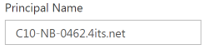 |
| itx-instancepickercontrol | classortypeprojectionid (guid) cssiconclass (string) alias (string) columns (string) filter (string, odata) |
Render a generic instance picker. | 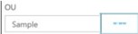 |
| itx-userpickercontrol | alias (string) use-global-operator (bool) columns (string) |
Render a user picker control. | 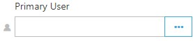 |
| itx-enumcontrol | property (string) show-fullpath (bool) |
Render an enum picker control | 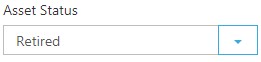 |
| itx-checkboxcontrol | Render a checkbox control |  |
|
| itx-datetimecontrol | show-time-part (bool) linked-mindate (propert) linked-mindate="ScheduledStartDate" |
Render a date and time picker | 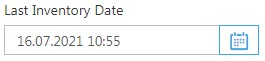 |
| itx-gridpickercontrol | target-class (guid) available-show (bool) available-header (string) available-method (string) alias (string) do-not-preload (bool) default-class (guid) |
Render a grid with add/remove button in separated block. the optional default-class attribute sets the initially selected class for the picker. do-not-preload="true" will prevent the picker from loading data until the user executes a search query. |
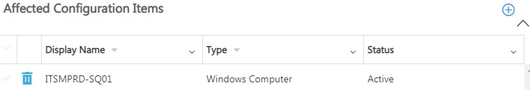 |
| itx-actionlog | analyst-log (string) system-log (string) user-log (string) attachments (string) |
Render an Action Log control in separated block |  |
| itx-attachmentsdropdowncontrol | property (string) | Render a drop-down field with attachments |  |
| itx-attachmentsgridcontrol | addedby-alias (string) | Render attachments as grid | 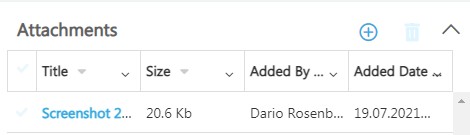 |
| itx-userinputcontrol | Render User Input (XML) as HTML table | 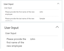 |
|
| itx-numbercontrol | max (decimal) min (decimal) decimals (int) |
Render spinner for int and decimal values. Decimals attribute allows you to set number count after the dot (0 is default, means integer) |
 |
Within a control you can access properties from other classes than the target class. You have to use the Type Projections Alias ([TPAlias].[Property]). The following example show a property of another class within a gridpicker:
<div e-column e-field="RWIAssignedUser.DisplayName.Value" e-headertext="@GlobalLocalizer["AssignedTo"]"></div>
Make sure you update your Type Projections as required, to access the property from the other class.
itx-instancepickercontrol
itx-isntancepickercontrol render single instance picker control and allow to choose one using picker with the grid. You can define columns in the picker using “columns” attribute. You must set this property as JSON array where each object is ui-grid column definition, for example (this is default columns for this control):
[
    {
        field: "DisplayName.Value",
        name: localization("DisplayName")
    },
    {
        field: "$Class$.DisplayName",
        allowFiltering: false,
        allowSorting: false,
        name: localization("Type")
    },
    {
        field: "$LastModified$.Value",
        allowFiltering: false,
        name: localization("LastModified"),
        cellTemplate: '<div class="ui-grid-cell-contents"><span itx-datetime="row.entity.$LastModified$.Value"></span></div>'
    }
]
To use inside of the form it’s hard to specify such string, because you must escape all HTML characters, but you can use Razor syntax to simplify this:
<itx- instancepickercontrol property="DisplayName"
    alias="AffectedUser"
    header="@GlobalLocalizer["AffectedUser"]"
    columns-span="4"
    columns="[@("{ field: \"DisplayName.Value\", sort: { priority: 0, direction: 'asc' }, name: \"" + sdkService.GlobalLocalizer["DisplayName"] + "\" },{ field: \"UserName.Value\", name: \"" + sdkService.GlobalLocalizer["UserName"] + "\" }, { field: \"$Class$.DisplayName\", enableSorting: false, name: \"" + sdkService.GlobalLocalizer["Type"] + "\" }")]"
/>
itx-userpickercontrol
itx-userpickercontrol is just a special case of the itx-isntancepickercontrol with predefined class and columns. You can redefined columns in same way as for itx-isntancepickercontrol.
Form Sample
Default Form
@using itnetX.ITSMPortal.Models.Forms
@using itnetX.ITSMPortal.Models.EMO;
@using itnetX.ITSMPortal.Shared.EMO;
@using itnetX.ITSMPortal.Models.MVC;

@model FormModel
@{
    ViewBag.Title = Model.FormName;
    Layout = Model.Layout;
    Model.CSSClass = "am-block";
}
@section emo_tabs{
    <itx-formtabs>
        <itx-tab header="@GlobalLocalizer["GeneralTab"]" id="general" />
        <itx-tab header="@GlobalLocalizer["RelatedItemsTab"]" id="relateditems" />
        <itx-tab header="@GlobalLocalizer["HistoryTab"]" id="history" />
    </itx-formtabs>
}

@section emo_header{
    <div class="col-sm-3">
        <ul class="list-unstyled">
            <li><b>@GlobalLocalizer["CITypeHeader"]</b><span ng-bind="formContext.$Class$.DisplayName" /></li>
        </ul>
    </div>
    <div class="col-sm-3">
        <ul class="list-unstyled">
            <li><b ng-bind="formContext.Status.DisplayName"></b><span ng-bind="formContext.Status.Value" /></li>
        </ul>
    </div>
    <div class="col-sm-3">
        <ul class="list-unstyled">
            <li><b>@GlobalLocalizer["CreatedOnHeader"]</b><span itx-datetime="formContext.$TimeAdded$.Value" /></li>
            <li><b>@GlobalLocalizer["LastModifiedHeader"]</b><span itx-datetime="formContext.$LastModified$.Value" /></li>
        </ul>
    </div>
}

@await Html.PartialAsync("[Subfolder]/[DefaultForm File Name]")
@await Html.PartialAsync("CI_RelatedItemsTab", new RelatedItemsSettings() { WIsAffectedAlias =  "RelatedWorkItem", WIsAlias = "ImpactedWorkItem", CIsAlias = "RelatedConfigItem", KBsAlias = "RelatedKnowledgeArticles", AttachmentsAlias = "FileAttachment" })
@await Html.PartialAsync("HistoryTab")
General Tab
One Column Mode
<div class="tab-pane active" id="general">
    <div class="itx-mod-col-slg">
        <div class="card-block collapse-card">
            <div class="header"><a href="#" class="heading pull-left"><span>Section Header</span></a><a href="#" class="arrow-collapse-btn pull-right"><i class="icon-dropdown_up"></i></a></div>
            <div class="collapse-content">
                <form role="form">
                    <div class="form-group">
                        <div class="row">
                            <!-- Add -->
                        </div>
                    </div>
            </div>
        </div>
    </div>
</div>
Many Columns Mode
<div class="tab-pane active itx-row" id="general">
    <div class="itx-mod-col-slg">
        <div class="card-block collapse-card">
            <div class="header"><a href="#" class="heading pull-left"><span>First section of Column 1</span></a><a href="#" class="arrow-collapse-btn pull-right"><i class="icon-dropdown_up"></i></a></div>
            <div class="collapse-content">

            </div>
        </div>
    </div>
    <div class="itx-mod-col-slg">
        <div class="card-block collapse-card">
            <div class="header"><a href="#" class="heading pull-left"><span>First section of Column 2</span></a><a href="#" class="arrow-collapse-btn pull-right"><i class="icon-dropdown_up"></i></a></div>
            <div class="collapse-content">

            </div>
        </div>
    </div>
</div>
Forms Customization (End User)
Shared Attributes
The below specified controls can use the following shared attributes:
Please Note
Shared attrbitues are not supported foritx-actionloganditx-attachmentsdropdowncontrol.
| Attribute | Type | Default Value | Description |
|---|---|---|---|
| property | string | The property of the class | |
| required | bool | false | Ignored for End User part |
| read-only | bool | false | Ignored for End User part |
| header | string | Required for controls which are not linked to a default property, for example in an itx-instancepickercontrol. For default properties like Title, Status, etc. it allows you to override the title. |
|
| description | string | The description will be displayed as tooltip on the controls title. For default properties it allows you to override the title. |
Available Controls
| Control Name | Configuration | Description | UI for End User portal |
|---|---|---|---|
| itx-stringcontrol | multiline (bool) | Render a string control with header. |  |
| itx-instancepickercontrol | classortypeprojectionid (guid) cssiconclass (string) alias (string) |
Render a generic instance picker. |  |
| itx-userpickercontrol | alias (string) use-global-operator (bool) |
Render a user picker control. |  |
| itx-enumcontrol | Render an enum picker control |  |
|
| itx-checkboxcontrol | Render a checkbox control |  |
|
| itx-datetimecontrol | show-time-part (bool) | Render a date and time picker |  |
| itx-gridpickercontrol | Render a grid with add/remove button in separated block | ||
| itx-actionlog | analyst-log (string) system-log (string) user-log (string) attachments (string) |
Render an Action Log control in separated block |  |
| itx-attachmentsdropdowncontrol | property (string) | Render a drop-down field with attachments | |
| itx-attachmentsgridcontrol | addedby-alias (string) | Render attachments as grid | 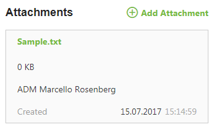 |
| itx-userinputcontrol | Render User Input (XML) as HTML table | 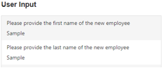 |
|
| @Html.Partial("Activities") | Add this section to display the Activities of for instance a Service Request | 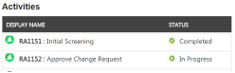 |
The parse-url attribute can only be used in the End User Portal. For links in views there is no need to add this attribute, they will be detected automatically.
Form Sample
@using itnetX.ITSMPortal.Models.Forms
@using itnetX.ITSMPortal.Models.EMO;
@using itnetX.ITSMPortal.Shared.EMO;
@using itnetX.ITSMPortal.Models.MVC;

@model FormModel
@{
    ViewBag.Title = Model.FormName;
    Layout = Model.Layout;
}
<div class="row title-cont-bl mod-req-p">
    <div class="col-lg-12">
        <div class="alert-bl pull-left"><i itx-objecticon="formContext"></i><span>{{formContext.Id.Value}}</span></div>
        <div class="h-status_rate-wrap pull-left">
            <h1>{{formContext.Title.Value}}</h1>
            <div class="status-rate-wrap">
                <div class="status pull-left"><i itx-statusicon="formContext.Status"></i><span>{{formContext.Status.Value}}</span></div>
            </div>
        </div><a class="cancel" href="" ng-click="closeForm()"><i class="icon-close"></i></a>
    </div>
</div>
<div class="row">
    <div class="col-lg-6">
        <div class="row">
            <div class="col-xs-6">
                <!-- Add-->
            </div>
            <div class="col-xs-6">
                <!-- Add-->
            </div>
        </div>
    </div>
    <div class="col-lg-6">
        <div class="row">
            <div class="col-xs-6">
                <!-- Add-->
            </div>
            <div class="col-xs-6">
                <!-- Add-->
            </div>
        </div>
    </div>
</div>
Console Task - Samples
The following example shows a console task which sets the status of an Incident to "Pending".
(function () {
    'use strict';
    var app;
    try { app = angular.module('itsmPortal.analyst'); }
    catch (e) {
        // module not found, exit
        return;
    }


    app.run(['consoleTasks', '$q', '$templateCache', 'globalizeWrapper', '$stateParams', '$rootScope', '$http', '$templateRequest','localization', '$compile', '$state', '$timeout', '$sce', 'CurrentUserFactory', 'backend', 'formEvents', 'dialogUI', 'createTasks', 'messages',
        function (consoleTasks, $q, $templateCache, globalizeWrapper, $stateParams, $rootScope, $http, $templateRequest, localization, $compile, $state, $timeout, $sce, CurrentUserFactory, backend, formEvents, dialogUI, createTasks, messages) {
        /************* BEGIN OF TASK ****************/
        var pendingIncidentTask = consoleTasks.createConsoleTask(
            "PendingIncidentTask", // Unique Internal Name for Task (no spaces)
            localization("PendingTask"), // Task display name (add string to resources)
            "pending", // CSS class used for icon
            // execute task
            function (selectedObjects, scope) {
                var self = this;
                // Context: From

                // create scope for dialog
                var dataContext = {
                    Comment: new EMObjectData("Comment", { Value: '' }, true)
                };
                var dialogScope = scope.$new(true);
                dialogScope.consoleTaskContext = dataContext;

                itsmportal.ui.showDialogForm(
                    localization("PendingTask"), // title
                    dataContext,  // context
                    $compile('<div class="form-group"><label>Comment:</label><textarea type="text" class="form-control required" name="Comment" ng-model="consoleTaskContext.Comment.Value" /></div>')(dialogScope), // form
                    // the following function is executed as soon as the user clicks OK in the dialog
                    function (dialogData) {
                        dialogScope.consoleTaskContext["Status"] = { EnumId: "b6679968-e84e-96fa-1fec-8cd4ab39c3de", IsDirty: true };

                        formEvents.fire("itxCreateActionLog", {
                            type: "System.WorkItem.ActionLogEnum.TaskExecuted",
                            title: localization("PendingTaskActionLogTitle"),
                            description: dialogScope.consoleTaskContext["Comment"].Value
                        });
                        delete dialogScope.consoleTaskContext["Comment"]

                        for (var i = 0; i < selectedObjects.length; i++) {
                            scope.$parent.update(dialogScope.consoleTaskContext);
                        }

                        dialogData.dialog.close();
                        dialogScope.$destroy();
                    }
                );
            },

            //check criteria
            function (objects, scope) {
                // only show task when user is on the Form and with status Active
                return scope.isForm && objects.length == 1 && objects[0].Status.EnumName == "IncidentStatusEnum.Active";
            }
        );
        // register the new task to be available for Incidents
        consoleTasks.registerConsoleTask("System.WorkItem.Incident", pendingIncidentTask);
        /************* END OF TASK ****************/
        }]);
})();
Get Parent Work Item of Form Filling Activity in External Data Script
When using External Data scripts, External Validation scripts or Default value scripts in a Form Filling Activity you might want to have the data of the FFA Parent WorkItem available too.
The following script will find the Parent WI of the FFA by specifying the FFA Id. The FFA Id itself is available in the $formData variable: $activityId = $formData["_ffaInstance"]
param(
    [guid]
    $activityId
)
Import-Module SMLets

function Get-SCSMParentWI($wiId){
    return Get-SCSMRelationshipObject -Filter "RelationshipId = '2da498be-0485-b2b2-d520-6ebd1698e61b' and TargetObjectId = '$wiId'"
}

$wiId = $activityId
do{
    $relObj = Get-SCSMParentWI $wiId
    if($relObj){
        $rootWi = $relObj.SourceObject
    }
}
while($relObj.SourceObject -and ($wiId = $relObj.SourceObject.Id))
return $rootWi